Gallery of past work

Thursday 30 June 2016

Pages from a concertina sketchbook

Mixed media experiments here using offcuts from manipulated photographs, tracing paper overlays with printouts of drawings, a Pitt pen and 'blind stitch' holes punched with a needle.

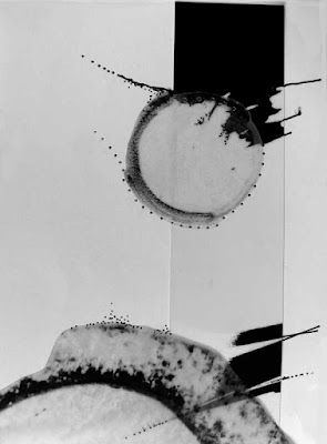
My thoughts were of buildings and roads seen in Australia, carved into the Outback and their effects on the Aboriginal peoples who have lived there undisturbed for 50,000 years. I've been playing for some while now with this imagery. As in all this work, in these small pieces the circles represent the waterholes and meeting places that are vital to the survival of  these peoples in this hostile environment. The fine meandering lines suggest their tracks through the scrublands. They are light and fine in quality to reflect the light touch on the environment made by these people. This contrasts with the thick, strong, dark lines which suggest the harsh and determined intervention of modern development.

In some of the following, the modern structures figure most strongly; in others it is the Aboriginal references.


These in reality are connected as they and others are all in the same concertina book form which unfolds and gives contrast from one image to the next. I found it impossible to photograph the book in its entirety. 


Monday 27 June 2016

On a day out and Cricket

I spent yesterday (trying) to watch that extraordinary summer game of Cricket in Bristol with my husband and wondering why, with our notoriously fickle weather, we in England favour a game that happens outdoors, takes most of the day and requires good weather and preferably many uninterrupted hours of warm sunshine for an outcome?

As you can probably guess, it rained, for most of the afternoon.


Then there are the rules and the objectives of the game. I once tried to explain them in French to visitors who came from north of Paris and who spoke no English. I quickly ran out of vocabulary (try finding the French for 'silly mid-off' or 'bowling a googlie'?). Full understanding of the importance in the game of even the simple words 'in' and 'out' never happened.

As a child, I frequently watched the game with my father who taught at a cricket-playing school and who was a keen supporter of the Hampshire county team. Such experience stays with you but I haven't spent much time in the more than forty years of marriage at cricket matches. I can't say I've missed the exposure but yesterday, if nothing else, proves that the game gives an excellent opportunity to people-watch when everything gets too slow and ponderous or when it pours with rain.

To be sure, despite the rain, yesterday was strangely encouraging and uplifting. All around us were people out to enjoy themselves. Much beer was drunk - much beer indeed - but there was no rowdiness or disruption even when play was stopped for the rain. Mexican waves kept up spirits as did pleasure in the company of friends and family. It was a timely reminder that we live in what is at base a kind, patient and tolerant country and we are lucky.

Long may this continue.


Friday 24 June 2016

A pot and a Referendum

Drawing Monday today (yes, on a Friday this time) saw me down at a local stately home near Bath. We were a slightly depleted group and as it poured with rain for most of the day we were driven inside to lurk in the conservatory and missed the beautiful gardens entirely. I produced this simple drawing of an 'inspired by Delft' pot.


Now I'm home and looking at it properly, it is rather tight and there are many problems with the ellipses. Perhaps it is a reflection of my post Referendum feelings on this sad day for our country.  The bus driver returning us to the car park at the end of the afternoon provided the only light relief of the day when he apologised for the awful weather. 'It has come up from France,' he said. 'I don't think they're very pleased with us today.'

I can only wonder what we have done ... and hope.


Wednesday 22 June 2016

Abstraction and getting less like a tree? Update #1

A comment by Olga Norris on my last post that said that she found it interesting that, despite much manipulation, the images I showed (originals to be found here) still looked like trees. She was absolutely right and, as I love a challenge, her remark provoked an enjoyable half hour with Photoshop and those images as I explored what it was that made them so obviously still suggestive of trees and what would happen if I changed certain variables.

Cropping still further, rotating, changing the colours, removing some of the small side branches, straightening and firming up the lines a little all seemed to do it to a greater or lesser extent. Choosing a simpler image was particularly useful and got me to the intended end point much more quickly.

The first image has some side branches removed, the line simplified somewhat and colour choice minimised ... but still is very much 'of trees'.


Cropped still further, rotated to the right and colours altered ... not trees at all? (though there is something very unsatisfying about the resulting image).


Free Transforming and Skewing slightly seemed to help.


Then I took the other simpler image (where I had in any case abstracted further in the original drawing) and I played with colour and line but little else ...


Then I changed the colour accent ... further from the original?


And still further and not trees at all? Here I rotated through 180ยบ, applied Free Transform and changed the colours yet again. 


Thank you, Olga. this was a most entertaining exercise which taught me much about line quality and its associations and about positioning colour to distract the eye. I found it especially interesting how a particular curved and slightly wobbly or random quality of line can be so suggestive of organic growth ...

There is also something else that is true about abstracting in this way. The image you begin with is a great help. Drawing with an end result in mind and taking care to ensure that the lines and marks are all interesting makes life easier.

So my last thought on this is that my favourite abstraction is the red and black image at the top of this post. Trees still obvious (though much more simply than in the previous post), and, to me at least, line quality the most pleasing and colour most striking.

I'd be most interested to know what you think!

Update #1 Following a comment below from Margaret Cooter, I played with the unsatisfactory second and third images, rotating again and applying Free Transform. As she suggested, I then swapped the bright green and the grey. After that, I used the same red, black, white colourway as the first image.


As suggested by Olga Norris, changing the colours on some of the vertical lines was also interesting. 


There were surprising changes all round, I think. and, for me, interesting lessons about changing line colours and using glaringly bright colour contrasts sparingly!


Monday 20 June 2016

Pine trees manipulated

Today, in my efforts to restart work, I played with the drawings shown in my last post. I printed out them out and coloured in small areas. I then photographed them again and played with them in Photoshop, a default medium for me when I'm not sure where to go. These images resulted.

Cropped, colour inverted, then changed and enhanced and possible colours explored ...


Image flipped horizontally, cropped further and a different colour palette used ...


Then irresistibly, another cropping turned into black and white with contrast enhanced (maybe some stitch possibilities?) ...


And all from this image ...


Ah, the joys of Photoshop and play!

Saturday 18 June 2016

Negative spaces and negative thoughts

Since our return from Scotland almost two weeks ago, I've struggled to find inspiration and focus. Tennis from Queen's Club in London showing on the television and the weaving of a small, as yet unfinished, panel while I watch haven't helped with the formulation of new ideas.

Photographing these simple line drawings of the negative spaces between trees in a favourite beauty spot in the Dee Valley, Aberdeenshire, has been the only output so far. I plan to work with them, although I'm not yet sure how.

Aspen trees on a river bank ...


Sots Pines against a pure blue horizon ...


And another group in simpler form ...


I will post photos of the weaving in due time, and of any outcomes from these images. 


Monday 6 June 2016

Yarn bombing with a difference!

Seen in a cafe in Braemar, Aberdeenshire, proudly whimsical ...


He was made of knitted triangles stitched together over an authentic red deer stag's head. I especially enjoyed the bullfinch perched on his antlers!

And then there was the knitted haggis and her offspring outside the cafe, collecting for a local charity ...


Now I know what to do with leftover weaving yarn?


Thursday 2 June 2016

Negative spaces and scots pines.

Walking and drawing yesterday on a beautiful, cloudless day in the Scottish Highlands (not usually many of those). The trees, the heather, the mountains looked wonderful.

We went to a favourite place, the Lynn of Quoich, up beyond Braemar and couldn't believe our luck.


Over lunch beside the stream, I spied rows of trees against the bluest of skies and drew the spaces between. 


Later, I manipulated one drawing in the photo package on my iPad ... Not the same as Photoshop, but fun for all that.