I had briefly come across the work of printer and mixed media artist Sumi Perera during one of those wanders around the internet that I find myself taking. This initial viewing really hadn't prepared me for the delicate delights and contrasts in her work when seen 'in the flesh'.
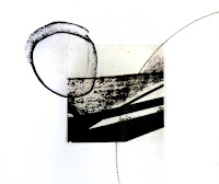
Quadrature of the Circle XII
Just before Easter, I went to a small exhibition of Perera's work in
New Brewery Arts, Cirencester, which was part of the
Impress 16 festival of print running in galleries throughout Gloucestershire till mid-April. Her work was intricate, beautiful and extraordinarily varied. There were artist's books, wall hung pieces and unframed prints. Her use of stitch was subtle and understated but, when it was used, it added texture and contrast in mark to her prints.
My own photos on this occasion were sadly most disappointing. I hadn't expected to have the time to visit the exhibition and so had left my camera at home. Family commitments over Easter have prevented a return to the exhibition. Therefore, for this post, I've been reliant on the few usable photos from my iPhone and those from other sources.
I particularly enjoyed the graphic nature of quite a lot of the pieces on show and Perera's frequent use of circles, often breaking out from the edge of the main image. This was especially obvious for examples from the
Quadrature of the Circle series (one of which is shown above).
One of the most beautiful and intricate pieces was a pair of long mixed media panels entitled
Unbuilding Block XII, a detail of which I managed to photograph reasonably well. This photo shows the detailed cut-outs which cast lovely shadows onto the wall.
Detail from Unbuilding Block XII
My photos of the whole piece were not good enough to show and I've been unable to find the exact work on the internet. I'm therefore showing another from the same series,
Unbuilding Block XX, to show the range and complexity of these pieces.
Intricacy was also to be seen in what was perhaps my favourite work
Rebuilding the Unbuilt-Y Block. I especially enjoyed the extended drawing lines into the areas of untouched white paper. They seemed to recall some of the things I've been trying to do in my own work.
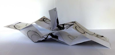
There was also much pristine, untouched space giving weight to the areas of printed image in the pages of her beautiful artist's books. I'm afraid that I'm unable to detail the following piece properly. The labelling is unreadable in my iPhone photos.
Beauty Is
I was undoubtedly enjoying work from a master-craftsman as I wandered around this exhibition. It was truly beautiful and wonderfully executed. Googling Sumi Perera's name will reveal still more delights for those who are interested.


