Gallery of past work

Friday, 19 June 2015

Indigos - dark intense blues

As regular readers of this blog will know, I've been taking the Pixeladies online Photoshop Elements 1 class recently. This has kept me fully occupied and left me little time for taking photos or hunting for indigos in my archives. I therefore offer just a couple that I've played with as part of  the course.

There will be more next time - that's a promise!

The Grand Canyon at sunset - the colours as I remember them
but the camera did not!


A stained glass window in Gloucester Cathedral 
taken last year when visiting this wonderful place with a friend
(image straightened and sharpened). 

And now to catch up with all those enticing indigo posts that await me.


Thursday, 18 June 2015

A little time to draw

Today when I was waiting for my husband in the coffee shop of our local hospital while he had minor treatment, I had just a few moments to draw, peacefully and without interruption.

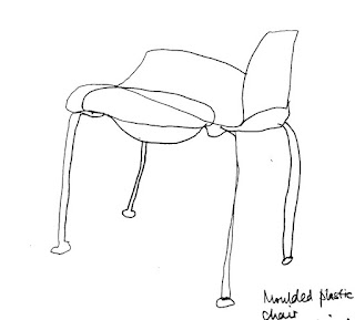
Blind drawing (with a few sneaky peaks) seemed to suit my mood and these two little pieces resulted, nothing earth-shattering or new, but very soothing to the soul.

The first things to catch my eye were the many moulded plastic chairs all round the room where I was sitting. I was especially taken with the shape of the seat.


Then I looked out of the window at rows of windows on a curved building opposite and drew some of those.

I would have liked to make a random pile of those chairs - and to be given half an hour to draw them without being thought mad! All those inter-locking legs and seats would have been fascinating...


Monday, 15 June 2015

More black and white and abstraction

I've been continuing with the Pixeladies Photoshop course 1 over the weekend.

Then today, we've been covering adjustment layers, a filter and the colour picker and brush tool all for adjusting photos.

These black and white images (I was supposed to working in monochrome and you can guess how well that suited me!) are the result, all taken from images of trees in Scotland and Somerset in the UK.

Trees in Glen Tanar, Aberdeenshire.


More trees beside Loch Kinord, also in Aberdeenshire. I've worked on an image similar to this before (I have lots) but not with adjustment layers. 


And last of all, a favourite view on a friend's farm in Somerset, (though too far west to show Glastonbury Tor this time) exploiting black/white contrast and diagonals.


These are all on my learning curve and I know there will be heaps more to learn in Course 2 which begins at the start of July. 


Saturday, 13 June 2015

Pixeladies PSE course 1

As I mentioned a couple of posts ago, I'm currently doing the Photoshop Elements 1 course with the Pixeladies. I can't recommend this course highly enough - it is clear, covers all the basic aspects of Photoshop (especially the dreaded layers feature which had always somehow eluded me) and is thoroughly enjoyable.

Before I began the course, I had been using Photoshop for some time but was accessing only a very limited range of the functions - mostly cropping images, adjusting and reversing colour, playing with contrast and occasionally adding special effects.

I think it has been a great help being familiar with the general layout of the programme before I began as I've been able to focus on those things that were new to me. Indeed, there have been many times when I've found much easier ways of doing things. However, for those who are completely new to PSE, everything is very clearly explained and the Pixeladies (Deb Cashatt and Kris Sazaki) give a lot of help through the forums where you can post questions and examples of your work.

Having discovered how to use brushes with layers in a previous lesson I went a little 'off piste' this morning and played with using the functions to make drawing and painting marks. I had somehow missed the enormous range available. I treated them as I've been treating my own mark making tools and made abstract marks. A small selection of the results is shown here. In each case I've explained the brush function I used for anyone interested in following this up. In almost every case, I applied the function very large as I was interested in seeing what marks would result.

Wet media brushes - watercolour heavily loaded - with eraser lightly applied in the centre.

Thick heavy brushes - smoother round bristle.

Natural brushes - thick pencil - with eraser lightly applied on bottom edge.

Wet media brushes - watercolour heavily loaded - eraser semi-transparent and applied in the centre. 

Special effects brushes - drippy watercolour - eraser semi-transparent gently applied. 

I am very conscious of the very soft focus of most of the marks I've chosen to use today, despite choosing the harder edged brush and pencil marks. The overall effect of this post seems to be rather mesmerising. It leaves me wanting to adjust my glasses! I think I will have to investigate all this further when I have more time. 

Back now to lessons and homework!

Tuesday, 9 June 2015

Glam Girls' Collage

I led a creative day today at a meeting of Great Western Embroiderers, the group I stitch and exhibit with. From time to time, we try to do things that take us outside our usual box and away from textiles and stitch. Where this takes us is always interesting and ideas generated often pop up unexpectedly in future work.

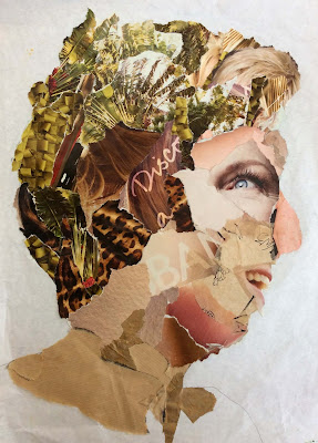
Today, We drew round projected silhouettes of our heads and shoulders and then collaged the images with torn up paper of various types and colours. The first shown below is a simple version I did before the meeting to illustrate the idea. After this, there follow several versions completed by members - some most unusual, and all reflecting aspects of the creator's personalities and interests.


I love the mad hair and the colour scheme of this one from new member Cath Smith ...


... and the mad, improvised eye and mouth in this one by Mags Griffiths.


I love the calm and the detail in this one (not yet quite finished) by Ruth Hayman - it reflects its creator ...


and the texture of the hair and the contrast with the disconcerting face in this one by Debbie Turner 


and more mad hair (and a nod to Ascot?) in this by Freda Skull.


Last of all, two that reflect the gardening interests of their creators, Caroline Goss ...


and Jane Smith.


Great fun was had by all and there was a most productive buzz about the room as everyone worked. I shall be fascinated to see in what form this appears in people's work. 

PS Sorry to those not featured here because your work was not finished. Email me an image when it's completed and I will add it to the post. 


Wednesday, 3 June 2015

Surfaces

I finished the first book of marks the other day. It's brim full of things - of marks that give me pleasure and that I will want to repeat, and those that are lackluster and repetitive; of those that started out looking great when ink or paint was wet and then dried into dull and dreary; and of those that seemed unspectacular at the time of doing but which seeped and spread and diffused to give really great and unexpected effects.

I've decided that this daily mark-making is a habit I want to continue but I feel I need to approach it in a different way in the next book. This time, my focus is on surfaces and the different effects that can happen when the same media are used on different papers.

I've collected a pile of potentials - the usual drawing papers in various weights, computer paper, old envelopes, tracing paper, parchment paper, newspaper, khadi paper, blotting paper, tracing paper. The pile is growing as I notice the range of papers around me and I wonder ...

The first surface I explored was a heavy blotting paper bought from my local art shop - wonderful textures resulted, here from twisting a nearly-dry 2 inch wide fibre marker over the surface ...


and here from sliding a black Conté crayon on its side down the paper, with varying pressure ...


Then I refilled the 2 inch fiber marker with black fountain pen ink (Quink in the UK) and dragged it horizontally across a choice of papers, varying pressure and reapplying where the spirit moved me. The resulting differences in intensity and colour if ink and texture of mark were most surprising.

First I tried this on Winsor and Newton medium surface cartridge drawing paper. Here, ink coverage was very even and there was little breaking or changing of the colour. The result was rather flat and gentle.


Then I tried the same process on a rough practice cartridge. Here there were very interesting textural effects and a good intensity of colour where extra layers were applied. 


And in the last of these, I repeated the process on khadi paper. Here there were interesting linear textures which reflected the structure of the paper but colour was rather dulled. 


I will keep going and I'm drawing useful conclusions from all this. For example, since I'm not as fired up by this as I was by the first book, it's interesting to consider that maybe I'm more instinctively drawn to making the marks themselves than I am to creating the surface on which they appear - or maybe I just haven't found surfaces that I might more enjoy exploring. 

I certainly must invest in some more varied types of good drawing / printing paper in order to find out ... any suggestions?

Or maybe it's because I'm short of time as I've also just begun a course with the Pixeladies to improve my skills with Adobe Photoshop Elements - watch this space ...!