Gallery of past work

Wednesday, 21 October 2015

Reflections, a street market, and a cathedral

Today, a potpourri of photographs from a recent visit to the eastern part of the country to see a friend. The first two photos show reflections and the fascinating metal structure that makes up The Forum in Norwich, a wonderful public space in the centre of the city;


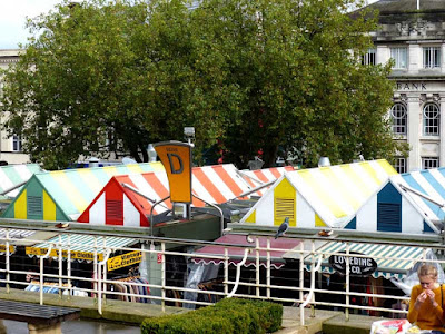
the next two show views of the permanent covered market in the centre of Norwich;


and the next three show the great contrasts (architectural and artistic) to be found inside Norwich cathedral, the first of beautiful, fragile old military banners from local regiments in the chapel of St Saviour photographed against the ancient arches of the cathedral, 


the next showing dramatic and beautiful contrast between the ancient stone work of the cathedral and a modern refectory addition,


and the last two an arresting installation Shadows of the Wanderer by Ana Maria Pacheco together with an explanation of its meaning by Neil MacGregor. It was an extraordinarily affecting piece, the experience of which was made even more powerful by the private concert being held in a part of the nave. We sat facing the piece while they played The Last Post, Abide with Me and The Lark Ascending by Vaughan Williams. It was haunting, beautiful and unforgettable. 


Thursday, 15 October 2015

Grey a current favourite

Today's search for Roy (the colours of the rainbow and beyond) was especially appealing. As regular readers of this blog will know, grey is a favourite choice right now for me (together with its close relations, black and white). I like the simplicity and contrast it can give and the ease of production with pencil and pastel.

Several of the photos shown here (I'm afraid I've exceeded the stipulated 5 photos as I seemed completely unable to cull satisfactorily) were taken from my own work, either in stitch, in mark-making or in photographs. Two of the shades of grey include hints of blue and others hints of olive green and purple. Grey (with black and white) seems to lend itself particularly to geometric and abstract shapes and there are photos I've taken of geometric and constructional forms, often seen during visits to galleries over the summer.  One especially shows a page of optical illusions - how small specks of black along with white appear grey to the naked eye.

Mark making in acrylic paint using a strip of cut up credit card

A steam locomotive wheel seen at STEAM  in Swindon

Hand and machine stitch sample on organza over random printed letter shapes

Underside of a footbridge over the River Dee in Aberdeenshire (other photos shown here) 

Grey fading to black - Leyah Titford 8 Ink Slides - seen at the Graduate show at Bath Spa University this summer. More of Leyah's lovely work can be seen here.

Muskets on the front stairs of Cawdor Castle, northern Scotland

From Carol Belanger Grafton 1976 Optical Designs in Motion 

William Gear Study in Grey 1953
Seen in The Pier Arts Centre, Stromness, Orkney

This includes but a small sample of my grey / black / white images. I collect them and have a large box of postcards and many sketchbooks /journals containing examples of my own work or of images that have taken my fancy. 


Tuesday, 13 October 2015

Grayson Perry's house in Essex

At the end of a lovely visit to see a friend in Essex this weekend, we walked to artist and Turner Prize winner Grayson Perry's extraordinary house at Wrabness on the banks of the River Stour.

Called A House for Essex and built as a record of the life of a mythical Essex woman called Julie, it makes an amazing statement in this quiet and unassuming landscape. It has been described as 'bonkers' (I'm not sure by whom) and if considering it simply as a dwelling, I would probably agree. However, viewing it as a folly, as an art statement, as a sort of giant installation full of Perry's work, extraordinarily crafted and full of symbolism, I have been fascinated by it.

Perry himself has described the house as 'a Fabergé egg of a building'. If I came away with nothing else from this visit, it was a feeling of great thanks to the planning authorities who had had the courage to allow such an extraordinary gem to be built.

We walked almost all the way round the outside and viewed it from a distance, enjoying every angle and its setting within the landscape. The roof is a wonderful glowing pale gold colour and it gives the whole building a temple-like aura enhanced by the church-like shape of the windows. Indeed, Grayson Perry planned the house as a 'secular chapel', a place of pilgrimage for Julie. He has described it as 'The Taj Mahal on the River Stour'.


Outside, the house is tiled from ground to roof with specially made tiles with motifs depicting events in Julie's life.


Sadly, I could see almost nothing of the inside since it is rarely possible to go inside unless you enter a ballot to reserve a stay for a short break (detailed here) at considerable cost so my impressions and the photographs of the interior are based on my viewing of the Channel 4 programme broadcast in May of this year and the various photographs available by googling.

The front room

Looking up at the ceiling in the Front Room
One of many tapestries around the house documenting 'Julie's' life

More details of the evolution of the building are to be found here and it is possible to view a 360 degree film of it here, though I only hope it streams more easily for you than it did for me. I suggest downloading fully before viewing (... and reading the instructions before you begin!). Even when I finally did so, I found it difficult to use, though the commentary gave a great insight into the symbolism of the house.


Monday, 12 October 2015

Mark making in Graphite

Mark making on Thursday was with graphite pencils of varying thicknesses and grades up to 8B. I experimented with ways to use the pencils - on their points, on their sides, at an angle and on their blunt end. I drew with control, smoothly and gently, or pressed hard and scribbled to discover which results satisfied and perhaps suggested landscape forms most successfully.


The drawings proved surprisingly difficult to photograph effectively but told me much, which is the main thing. It will be interesting to see how well they combine with acrylic paints ... the next project. 


Thursday, 8 October 2015

Scottish Reflections

Today, more photos of a recent trip to Scotland - this time taken on and around a favourite foot bridge at Cambus O'May over the River Dee near Ballater in Aberdeenshire - and exploring the idea of reflections.

First of all, my husband leaning on the bridge and looking up river, reflecting, perhaps, on the thought that he has been coming to this beautiful valley for almost 60 years.


The bridge and its reflections looking down river towards Aboyne ...


...and looking from the other direction through birch branches covered in lichen ...


... and looking directly down from the bridge at the river bank, darkly reflected in the peat coloured water ...


To finish, two photos of dippers perched on rocks. We saw four of these delightful birds at the same time going about their business and watched them for almost half an hour, but they weren't very willing photographic subjects. Even with a zoom lens that perfect shot was elusive ...

Tuesday, 6 October 2015

Salt crystals and Quink ink

I have long been wondering whether the coarse salt crystals that I've often used to produce a variety of effects with watercolours would work with black Quink ink. A couple of days ago, I decided to try.


The answer is that I think they do, up to a point. The effects seem to show up more clearly when the ink is less concentrated. Coarse crystals definitely worked better than fine ones. My results using the latter weren't worth showing.

Sometime soon, I'll try this technique with blue and blue-black Quink. I'm expecting similar effects, though in my experience, these two colours don't split into their different colours in such an interesting way. 

For those interested, the ink effects were produced in a similar way to my post of last week here. This time, I made sure that the surface was very wet, added extra ink with a dropper and then added the salt crystals, leaving everything to dry on a flat surface.