Gallery of past work

Saturday, 28 February 2015

Water soluble graphite pencils

I recently bought three water soluble graphite pencils, 8B, 6B, and 4B, and have been trying them out.
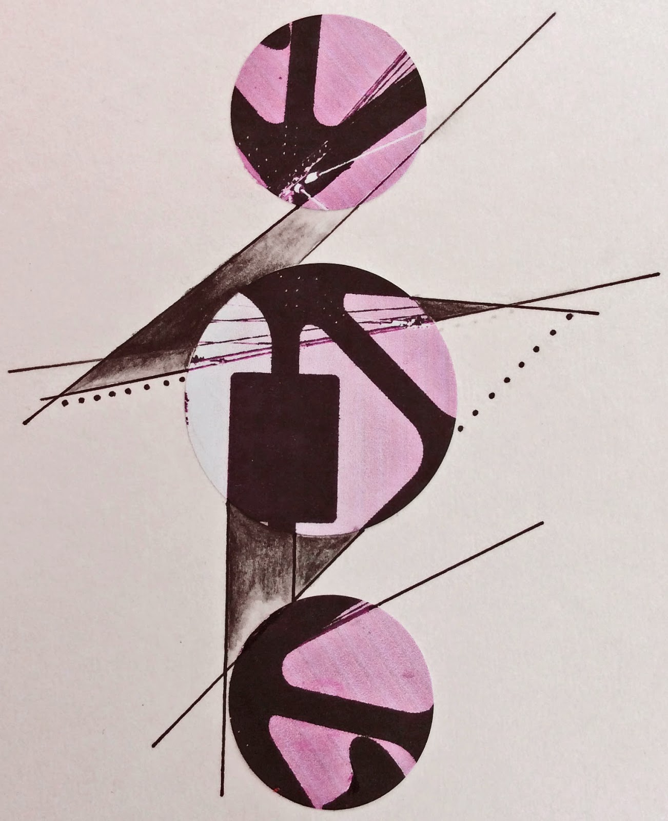
Here in these samples, I've worked on an enlarged and cropped section from a photo of a metal suspension bridge structure. It had printed out in unexpected and unrepeatable colours thanks to the fact that I had ignored the warning on my printer that an ink cartridge need replacing ... just shows it doesn't always pay to heed warnings!

I then added simple extended lines to the image and filled in some of the negative spaces with the graphite pencils where I felt something might be gained.

I'm interested in the way the extra lines and graphite shading around the central circle seem to give added perspective and depth. They bring forward the black bridge structure and throw the fine lines of the bridge cable back.

I then cropped further, rotated and altered the colour in Photoshop.


... Some ideas to use in my stitching?

Tuesday, 24 February 2015

Evening Stitching

I always like to handstitch in the evenings- but I almost never pick up a needle for a prolonged session during the day. There seems to me to be something guilt-inducing about sitting down in the relaxed way necessary for enjoyment when there are things to be done, be they experimenting with new ideas for textile work, or drawing ... or (unfortunately and as infrequently as I can get away with) household chores. Stitch is a meditative business. The repetitive in and out of the needle and the gradual generating of pattern and line seem particularly suited to the end of the day.

I always have at least a couple of small pieces in progress, sometimes working out stitch ideas and sometimes stitching intuitively on a random ground. I often have two levels of thought going on in my mind: the main reason I had for stitching at the beginning and other thoughts that may surface during the piece as it develops.

In a couple of posts since Christmas, I've posted some of these little pieces and this week, I've been working on another. I've repeated the 8 inch square format of many recent smaller pieces as I find this size very manageable as I experiment - not so big that it takes ages to complete and not so small that it becomes fiddly and limits me in exploring ideas.


When I began this time, I had few preconceived ideas except to explore the length, spacing and intensity of stitch, and also some possible stitch combinations and how they relate to one another. I was responding intuitively to a random, abstract mono printed ground, developing stitch as mark.

I made just a very few rules for myself, feeling the need for something to prevent the piece getting totally out of control. These were around how to treat edges (which threads to extend from the stitched surface at the beginnings and ends of rows) and the interplay between the stitch and the ground (stitching mainly into the light areas on the cloth).

I also gave myself a high horizon - much higher than I would usually choose. I was exploring the limits of what is possible while still maintaining some balance within the piece.

The thoughts in the back of my mind have been to do with exploring ways of creating contrast, movement and tension within the piece. I've also experimented with which areas to leave completely unstitched.

... and to relieve the monochrome, there is just a hint of red in the stitching ...!

Sunday, 22 February 2015

Printed fabric from Fingerprint

For some time, I've been dissatisfied with the quality of the print outs of my images using a standard inkjet printer. The crispness of the image and the colour reproduction are often very disappointing and I'm pretty sure the finished work would fade if hung in strong light, although I have yet to experience that personally.

I've considered many other printing methods and, while each has its appeal, they are not ideal for the digital images I generate from my own photographs. I find the methods at best slow to execute and it's difficult to try out different effects and make changes quickly as I experiment. Some ways of preparing the fabric to improve printing, waterproofing and lasting qualities leave it stiff and unpleasant in the hand for stitching.


One line of thought I've pursued is to send off the images for commercial printing to Laura Kemshall's company Fingerprint, following a recommendation from Olga Norris. Two weeks ago I ordered two fat quarters of fabric to be printed with my own bridge shadow photographs onto plain cotton.

The parcel containing the fabric arrived on Friday and I am delighted with the results. The images have come up crisp and clear and the colours are very true to the original. The cloth is soft in the hand and will be a pleasure to stitch I feel sure.

Fingerprint seems to offer an excellent service. On the website, it is very easy to upload and organise images to make best use of the space allowed.


The charge was extremely reasonable - £6.00 per fat quarter, including postage. I could have ordered long lengths as well as the small fat quarters I chose for my experiment, also very reasonably priced.  

My only warning would be that my order took two weeks to arrive. Had I been in a hurry, this could have been a problem. It is certainly necessary to plan ahead when using this service but maybe this is only to be expected. I will surely use Fingerprint again. It was a personal and considerate service producing high quality printing.

Indeed, an extra fat quarter with my images was accidentally printed onto a light weight cotton as well as the plain cotton I'd ordered and this was sent to me free of charge.

What more could I ask?


PS Following this post, Laura Kemshall has kindly sent me details of the turnround times for Fingerprint to help with planning the timing of orders.

She says:  'We usually give a guideline on turnaround for printing of approximately 10-12 working days although this can be a little longer at busy times. The actual custom printing and finishing process takes on average four days depending on quantity. If you’re working to a deadline just let us know and we will always do our best to fit in with your schedule.' 

I hope this will be helpful for anyone planning to use this excellent service.


Friday, 20 February 2015

On orange and starting school

My taste of orange for this month is a simple set of photographs all taken in the past week with our oldest granddaughter. Time was in short supply as we spent this valuable time with her during her mid-term break from school.

For those who may be surprised at how young she is in the final photograph, children start formal school amazingly early here in the UK. Most, like her, start in the September before they are 5 years old. For her, this meant her school life began at the age of 4 years 6 months. For some who are born at the end of August, it can mean they are only a day or two over 4 years old when they start. Our granddaughter loves everything about it but I'm not sure what I feel about the principle of it at all!

On a trip to a local play area with her, we found these unusual pieces of play apparatus, conveniently containing orange, and all greatly enjoyed by our small visitor.

A great climbing frame which gave opportunities for all sorts of imagining ...


... a 'spinning whizzer' (a dizziness-inducing rotating bucket that required much pushing) ...


... and a four-way see-saw that seemed to cope with all extremes of weight ...


Next comes a bit of playing we did together on my graphic pad in Adobe Photoshop. Our granddaughter was particularly interested in how we could so easily invert and change the colour. Many versions were achieved, including this one where orange triumphed.


And last of all, here she is in a crown we made on her first day (a wet afternoon) and which she wore for most of the week!


All is now quiet and peace as she has returned home. We will miss her ...

Tuesday, 17 February 2015

Spring Sunshine and Snowdrops

Today was a beautiful, gentle early spring day and a wonderful chance to see the snowdrops which flower in such profusion each year all around the grounds of Lydiard House near Swindon, only about 12 miles from where we live.


We have our four year old granddaughter staying this week for the half term holiday.. She cycled and we strolled in the warm afternoon sunshine. What a pleasure it was and what a lovely hint of the spring warmth to come!

Friday, 13 February 2015

Making a mark with oil pastels and a blue crayon

I spent time this afternoon making marks on paper with crayon and with oil pastel smeared with a finger. Perhaps as a rest from all the straight lines I've been generating recently, curves and circles miraculously appeared ...


Definitely light relief ... and playing because I felt like it.

Wednesday, 11 February 2015

A whole greater than the sum of its parts?

Yesterday afternoon, as a relief from strict black and white, but still fascinated by the abstraction possible from man-made shadows, I printed a favourite photograph onto cartridge paper, chosen because I wanted a slightly soft edge to the lines in the image. To exploit its graphic quality, I had first intensified the black / white contrast in Photoshop and then enlarged the whole.

When the print was thoroughly dry, I applied bursts of colour with Faber-Castell Polychromos crayons (another reason for the choice of paper). I chose blue to hint at the water flowing below the footbridge in the picture and also because this particular shade of turquoise seemed to work well with the intense black of the shadows.

I then identified small snippets (like those above and below) that I felt worked individually as tiny pieces. I used a small square cardboard window and cropped them with a craft knife.


Then I rotated, positioned and arranged them into the grid form below in an attempt to give a whole which related also.


It was extraordinary how different the various arrangements looked ... but was the final whole that resulted from this bit of fun greater than the sum of its parts? I leave others to decide ...

Monday, 9 February 2015

Research and paper trials

After the helpful responses to a previous post on printing out my images, I've been following up all sorts of  leads.Very many thanks to those who replied to my queries.

First of all, I've ordered up a printed sample from Fingerprint. I'm not sure what had held me back from investigating this service before as I knew of its existence. Maybe it was because I had thought it was available from Laura Kemshall's  main website - which is not the case as far as I can see.

Now I've found it, I'm happy to say the website is very easy to use. Three sizes of fabric are available (fat quarter, half meter and full metre) and several types of cotton. I was able to upload my images easily and to arrange them on the fabric myself to maximise use of the available space. As this was an experiment with the process, I opted for a fat quarter - £6 including postage. It should arrive in the next few days.

I've also ordered samples of cloth from Crafty Computer Papers to try out and a book Digital Art Studio, both recommended by Olga Norris. The latter arrived this morning courtesy of Amazon and a birthday token and looks at first glance to be jam-packed with useful information. I plan to go and see a supplier of Epson printers later this week - so excellent progress then! I am coming closer to deciding how to proceed.

Meanwhile as I waited for everything to arrive, I've been having fun. At the start of new work, I always like to play round the subject, investigating various ideas and trying to think laterally. So far, I've been experimenting quite a lot in paper and stitch so I include here some pages from my latest large sketchbook, They show paper trials with bridge images.


In the first, I've played with disrupting the image by chopping it into strips, and then reorganising and rotating before sticking them down onto a black background for contrast - a favourite technique of mine.


In the second, I traced one of the motifs from different bridge image, cut it out twice in black paper and rotated and played with various layouts till it seemed to offer something interesting. I then added dotted and dashed lines in black felt pen and graphite pencil to simulate stitch.


Last of all, I took photos of stitch experiments shown in October, mounted them on white cartridge, extended the lines of the design and the stitch from the photos using a black gel pen.

I feel I have a lot to absorb at the moment - investigating a new printer, the latest update of Photoshop, using my iPad for sketching out and about - and that doesn't include the Intuos graphic pad my husband kindly bought me for Christmas and which I haven't even taken out of its box ... am I trying to do too much all at once? It has all been too tempting!


Saturday, 7 February 2015

A Glass Roof and Light

I posted photographs a couple of weeks ago of a recent visit to the Pitt Rivers Museum in Oxford, a wonderful space crammed full of extraordinary artifacts. Right next to it and part of the same complex is the Oxford Univeristy Museum of Natural History, also well worth a visit if you particularly like dinosaurs and other extraordinary creatures, as does my husband.

However, I must confess that for me, the most interesting thing about the OUMNH is the lovely light, airy building it is housed in. Built in the mid nineteenth century, it has a wonderful light glass roof supported by fine stone pillars each one made from a different British stone. The effects varied with the changing levels of sunlight outside and the roof, the light and the pillars offered great opportunities for photographs and, now following our visit, for playing in Adobe Photoshop.

The first from my camera roll is a shot taken towards twilight ...


Then a close-up with contrast intensified to bring out the structures ...


A further close-up changed to black and white with all colour removed ...


And the same image rotated through 180 degrees and with black and white inverted ...


And the last, a reflection caught in a display cabinet, 


... and then colour enhanced and inverted ...


Overlooking all this light and splendour and at first floor level is a small café - a most restful place to eat a light lunch as you look at the intricately built roof.


Wednesday, 4 February 2015

Bridging shapes and printing

Especially when I'm beginning a new train of thought I seem to have several things in progress at the same time. One simmers away in the back of my brain while I work away at another. I find this very helpful.

At the moment, as well as completing all sorts of stitch trials some of which I've blogged about since Christmas, I am playing with ways of using the photos of the lovely white iron footbridge over the Delaware River that I took when I visited Pennsylvania last September (posted here on my return).

I found the shadows cast on the bridge deck quite mesmerising. They were so complete; the sun was hot and the light intense and from exactly the right angle to cast the shadows along the whole length of the bridge.

I took many photos some of which I have since cropped. rotated and printed out onto A4 paper. I have now cut them up and am trying out various arrangements to see how I can produce some stitch work exploiting the design qualities of the images and the perspective of the bridge.

This, in paper, is the first that I've felt I wanted to keep and work on, although I think there are still issues to resolve with the design - and many to resolve when I come to working in fabric.

Not the least of these problems is the best and simplest way of getting the images onto the cotton ground that I have in mind. I need to decide on the way to print (or have it printed) so that it won't fade or be damaged if it becomes damp. I know from previous experience that, although I can print straight onto cotton quite successfully using my inkjet printer, the result is neither light fast nor damp proof and it can be easily damaged.

The second thing that is concerning me is how to print it so I'm not left with a horrible firm surface to stitch into. I've found that treating the cotton ground before stitching generally leaves the fabric unpleasant in the hand and many commercial processes seem to do the same thing.

I have just found a printer locally who is willing to print cotton for me and the process he uses seems to leave the fabric fairly soft. I plan to give it a go and see what happens.

I am also investigating the purchase of  a much better printer for use in my textiles - though I have yet to find quite the right thing. I like the thought of having the printer available so I can print spontaneously and quickly and would love to find something that would print on fabric to a good quality. Silk screen and block printing don't seem to offer the speed and spontaneity I'm after, though I'm considering those too.

All helpful suggestions would be most gratefully received - especially on available printers that meet my needs - and that are not crazily expensive!


Monday, 2 February 2015

Friendship, a favourite view and trees

We visited very dear friends in Somerset this weekend - a wonderful time was had as always.

One of the pleasures of visiting them in their lovely house is the unsurpassable view from their farm to Glastonbury Tor.  I've shown photographs of this view several times before but can never resist attempting another take on it, telling myself the light will be different or the time of day will give different shadows.

Here are two taken yesterday before we left - the first of that view, framed by trees and a post and rail fence ...


and the second of the group of trees in front of their house with the Tor just visible to the left ...


This group holds a particular fascination for me and I've photographed them in all seasons and in all weathers. My favourite though is shown here, with their bare branches framing that glorious view beyond. 

There is something special and satisfying about the distance between them, the very subtle angles of their trunks and the slightly twisted branches which intermingle above eye level ... and of course, there is the association with our friendship.

I have in mind a piece of stitch as a gift for our friends to include these trees, so I've transformed them to black and white and upped contrast and brightness in Adobe Photoshop.


I will post when anything fruitful materialises.